
كيفية انشاء design system خاص بك في ريأكت
فى الثريد دى هتكلم عن ازاى بطبّق ال design system فى الفرونت اند.
الثريد دى هتساعدك لو انت fullstack او فرونت اند وهتلاقى فيه implementation.
انا بفضّل استخدم styled system concept عن حاجة زى tailwind css مثلًا، فال styled system انت بس بتعمل ال theme configs وبتستخدم ال components من غير ما تغير فيها styles تانى، كل اللى بتعمله انك بت import ال component من ال lib وخلاص وهو بي render بال styles.
فى كذا ui framework بيستخدموا ال concept ده زى material ui و theme ui و chakra ui بس ممكن تلاقى اختلافات بسيطة فال implementation، انا فى الثريد دى هقولكم ازاى نعمل Button ب chakra ui.
اختيار ال Theme
اول حاجة هنختار design system من figma community وليكن ده ال design الجميل ده.
Project Setup
بعد كدة هنبدأ نعمل setup للبروجكت https://chakra-ui.com/getting-started.
// src/index.tsx
import { ChakraProvider } from "@chakra-ui/react";
import "@fontsource/patrick-hand/400.css";
import * as ReactDOMClient from "react-dom/client";

import App from "./App";
import theme from "./theme";

const rootElement = document.getElementById("root");
const root = ReactDOMClient.createRoot(rootElement);

root.render(
  <StrictMode>
    <ChakraProvider theme={theme}>
      <App />
    </ChakraProvider>
  </StrictMode>
);
Theme Customization
بس وبعدين نبدأ ن customize ال theme حسب ال design system بتاع figma اللى اخترناه https://chakra-ui.com/docs/styled-system/theming/customize-theme واول حاجة ال foundations نعملها الاول بس
// theme/foundations/index.ts

export default {
  colors: {
    black: "#333",
    darkGray: "#7D7D7D",
    gray: "#B4B4B4",
    lightGray: "#EEE",
  },
  fonts: {
    heading: "Patrick Hand, sans-serif",
    body: "Patrick Hand, sans-serif",
  },
  fontSizes: {
    md: "1rem",
    lg: "1.2rem",
  },
};
وبعدين نعمل ال components وده مثال لل button
// theme/components/index.tsx

export default {
  Button: {
    baseStyle: ({ theme }: any) => ({
      _disabled: {
        opacity: 1,
        cursor: "not-allowed",
        boxShadow: "none",
        border: "4px solid",
        borderColor: theme.colors.black,
        bgColor: theme.colors.gray,
        color: theme.colors.black,
        _hover: {
          borderColor: theme.colors.black,
          bgColor: theme.colors.gray,
          color: theme.colors.black,
        },
      },
      _hover: {
        _disabled: {
          borderColor: theme.colors.black,
          bgColor: theme.colors.gray,
          color: theme.colors.black,
        },
      },
    }),
    sizes: {
      md: {
        border: "none",
        boxSizing: "border-box",
        borderColor: "black",
        padding: "12px 24px",
        fontSize: "lg",
      },
    },
    variants: {
      outline: ({ theme }: any) => ({
        border: "4px solid",
        borderColor: theme.colors.black,
        color: theme.colors.black,
        bg: theme.colors.white,
        _hover: {
          bg: theme.colors.lightGray,
          color: theme.colors.black,
        },
        _active: {
          bg: theme.colors.gray,
          color: theme.colors.black,
          borderColor: theme.colors.black,
        },
      }),
      solid: ({ theme }: any) => ({
        border: "4px solid",
        borderColor: theme.colors.black,
        color: theme.colors.white,
        bg: theme.colors.black,
        _hover: {
          bg: theme.colors.darkGray,
          color: theme.colors.white,
        },
        _active: {
          bg: theme.colors.gray,
          color: theme.colors.white,
          borderColor: theme.colors.black,
        },
      }),
      ghost: {
        _hover: {
          bg: "transparent",
        },
        _active: {
          bg: "transparent",
        },
        _focus: {
          bg: "transparent",
        },
      },
    },
  },
};
فال function اللي فوق انت بسهولة جدًا تقدر ت access كل ال theme وتقدر تستخدم اللي عايزه يعني.
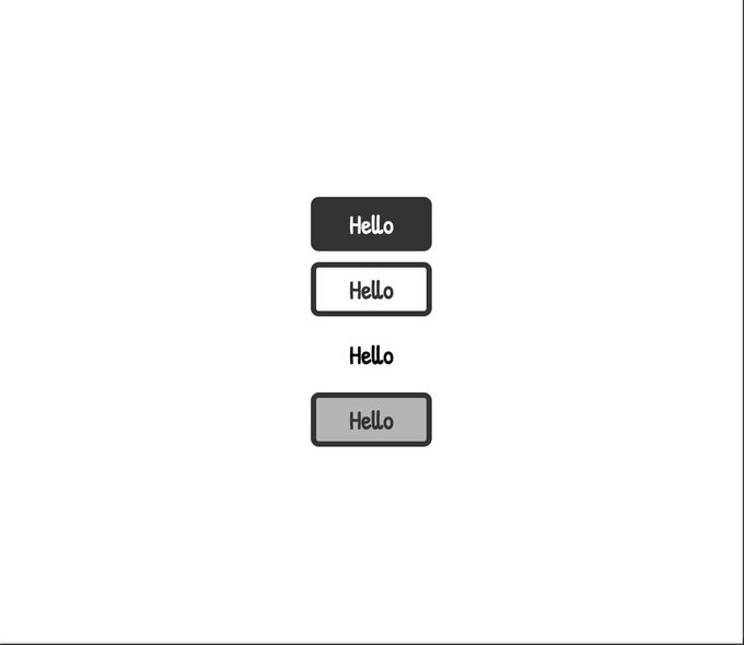
النتيجة
بس انت كدة عملت كل ال styles اللى محتاجينها لل button بعد كدة فى اى مكان عايز تستخدم فيه ال button بس بتعمله import من ال lib ومش مضطر لا تعمل component جديد بنفسك ولا تغير styles فى اكتر من مكان.
import { Button, Center, VStack } from "@chakra-ui/react";

export default function App() {
  return (
    <Center minH="100vh">
      <VStack>
        <Button>Hello</Button>
        <Button variant="outline">Hello</Button>
        <Button variant="ghost">Hello</Button>
        <Button disabled>Hello</Button>
      </VStack>
    </Center>
  );
}
بس بقى ده كدة ال Button component بنفس الديزاين سيستم وتقدر تستخدمه فالبروجكت كله من غير ما تكتب styles تانى وال files بتاعتك هتكون مركزة اكتر على ال logic.
بس انت تقدر تعمل كدة مع باقي ال components وتقدر تغير وتستخدم styles global.