
Customize MUI theme with TypeScript
Read more on design system from my notes
Ok, this is a quick tutorial on how to customize the default theme in mui v5. we'll just customize the button component.
Project Template here
First thing, let's create our folder structure.
Our folder structure is one of the basic setup we will do on our tutorial. it helps us to know where we will write our code in an organized way. Ok, so I prefer this structure while setup any theming whatever the ui framework I use.
.
└── theme/
    ├── foundations/
    │   ├── palette.ts
    │   ├── typography.ts
    │   ├── ...
    │   └── index.ts
    ├── components/
    │   ├── button.ts
    │   ├── ...
    │   └── index.ts
    └── index.ts
Now, we have two main folder, the first one will be foundations folder, and it used for basic theme variables, and the other one is components for components theming.
In each folder we created index.ts file to export all from it.
Next, let's build the theme from the end to beginning.
open the theme/index.ts to import our foundations and components that structure our theme
import { components } from "theme/components";
import { foundations } from "./foundations";
import { createTheme, ThemeOptions } from "@mui/material";

const themeOptions: Omit<ThemeOptions, "components"> = {
  ...foundations,
};

export const theme: ThemeOptions = createTheme({
  ...themeOptions,
  components: {
    ...components,
  },
});
No magic, ha?
ThemeOptions will perfectly handles the types for the passed properties. We excluded the components from themeOptions vars and passed it inside the createTheme function, you can modify it to update it directly inside the variable.
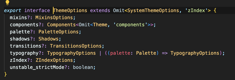 Based on mui, Here's the
 ThemeOptions interface, this will make our writing code is super easy and straightforward. How?
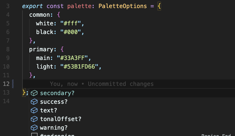
We need to customize the theme colors for example, it called palette and its type is PaletteOptions
So here's our theme/foundations/palette.ts
import { PaletteOptions } from "@mui/material";

export const palette: PaletteOptions = {
  common: {
    white: "#fff",
    black: "#000",
  },
  primary: {
    main: "#33A3FF",
    light: "#53B1FD66",
  },
};
And because we've used the correct Interface so the editor will help us continue writing the remain properties
The Question will be, What if I need to add a new color schema. The Answer is Simple as this
declare module "@mui/material/styles" {
  export interface PaletteOptions {
    blue?: PaletteColorOptions;
  }
}
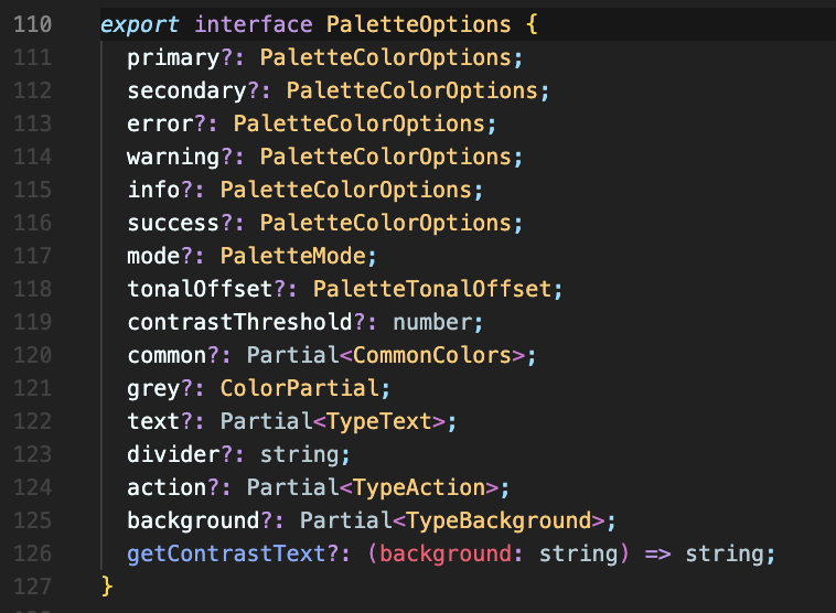
How did I know about PaletteColorOptions ? it's not a magic, I clicked on PaletteOptions and checked the type for the already existing colors schema.
Ok, until now everything is super easy right?
What about customizing the components theme?
Ok ok, the MUI Button component located here and they call it MuiButton.
But let's create the components object that will be exported inside the createTheme.
and it's simple as this theme/components/index.ts
import { Components } from "@mui/material";

export const components: Components = {};
after that TS will help you writing your components.
First thing, let's create our type for the MuiButton component theme, open the theme/components/button.ts
type muiButton = {
  defaultProps?: ComponentsProps["MuiButton"];
  styleOverrides?: ComponentsOverrides<Theme>["MuiButton"];
  variants?: ComponentsVariants["MuiButton"];
};
We got it from the .d.ts file located in the mui package files inside the node_modules folder. No magic!
Note: Feel free to use interfaces or types for this.
After that let's create our custom theme for MuiButton
declare module "@mui/material/Button" {
  export interface ButtonPropsVariantOverrides {
    isActive: true;
  }
}

export const MuiButton: muiButton = {
  variants: [
    {
      props: { variant: "isActive" },
      style: ({ theme }: { theme: Theme }) => {
        return {
          color: theme.palette.common.white,
        };
      },
    },
  ],
};
- I created a new variant for the
Buttonyou can use it inside your code. - TS will be your guide while customizing the component.
Note: I added export word before interface ButtonPropsVariantOverrides to avoid the eslint rule unused-imports/no-unused-vars
Now, We need to wrap our app with this theme
import { theme } from "theme";

<ThemeProvider theme={theme}>{children}</ThemeProvider>;
Tada! 🎉
Project Template here